

Why Were People Attending Church More (or Less) in 2022 vs 2020?
A very deep dive into panel data about religious attendance

I am going to show you a graph that is, on its own, not very revealing. It’s from the Cooperative Election Study, a survey collected late in 2020 and then again in 2022. When I show you the graph below in this manner, it’s no different from any other type of longitudinal data: here’s where things were in 2020, and here’s how the questions were answered two years later.
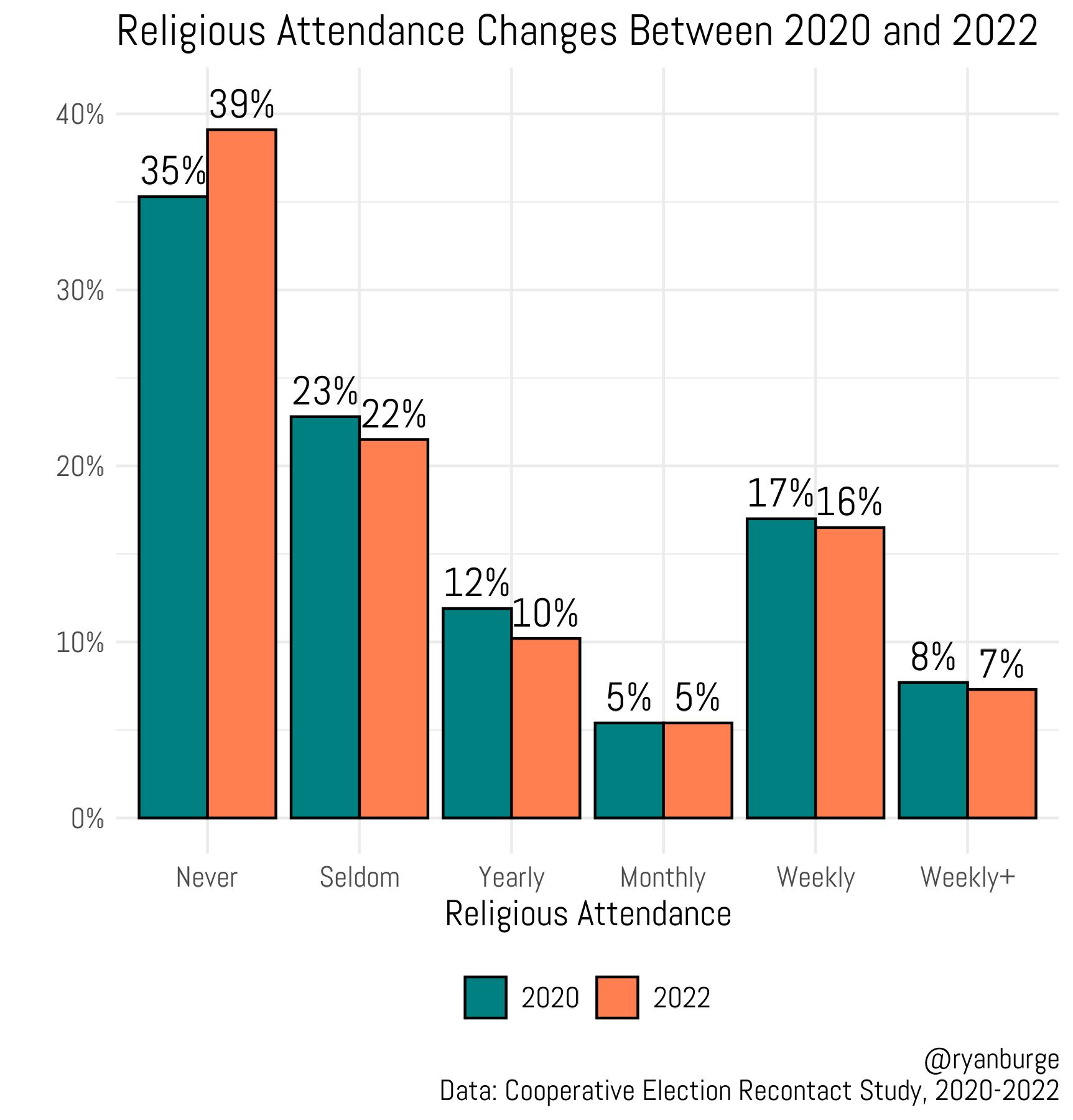
There isn’t a ton of variation at each level of religious attendance. In almost every case, it’s just a point or two. The only really noteworthy finding is the “never” attenders. They were 35% of those surveyed in 2020. In 2022, that had jumped by four percentage points to 39%. The other bars move a point or two to reflect this change.
Religion in 2022 Compared to 2020

Anyone who went through graduate school in political science is going to understand this story progression pretty well.
But what if I told you that I can do something else with this data that is exponentially more illuminating to those of us interested in the changing religious landscape? Because this data is of a different type—it’s panel data. Instead of just grabbing a random sample in 2020 and then grabbing another random sample in 2022, this survey is set up differently. They polled 61,000 people in the fall of 2020 and then recontacted over 10,000 of them two years later. So, when you see that “never” bar go up, I can actually show you where that four percent increase came from by tracking how each individual respondent answered the attendance question in 2020.
That’s the point of this post—nine more graphs that focus on just that single inquiry: how did church attendance change in 24 months, and what demographic factors like age, gender, and race led to people increasing or decreasing their church-going? There’s a lot to digest here, so let’s get to it.