

Why I Can't Tell You How Quakers (or Unitarians) Voted in 2024
Let's take a minute to talk about the data available in religion and politics.

I’ve got to admit that I am writing this post while gritting my teeth just a bit. Which is probably not a good state of mind, but I just have to get all these thoughts down in a single post. Let me tell you what is driving my consternation.
I will post a graph such as this:
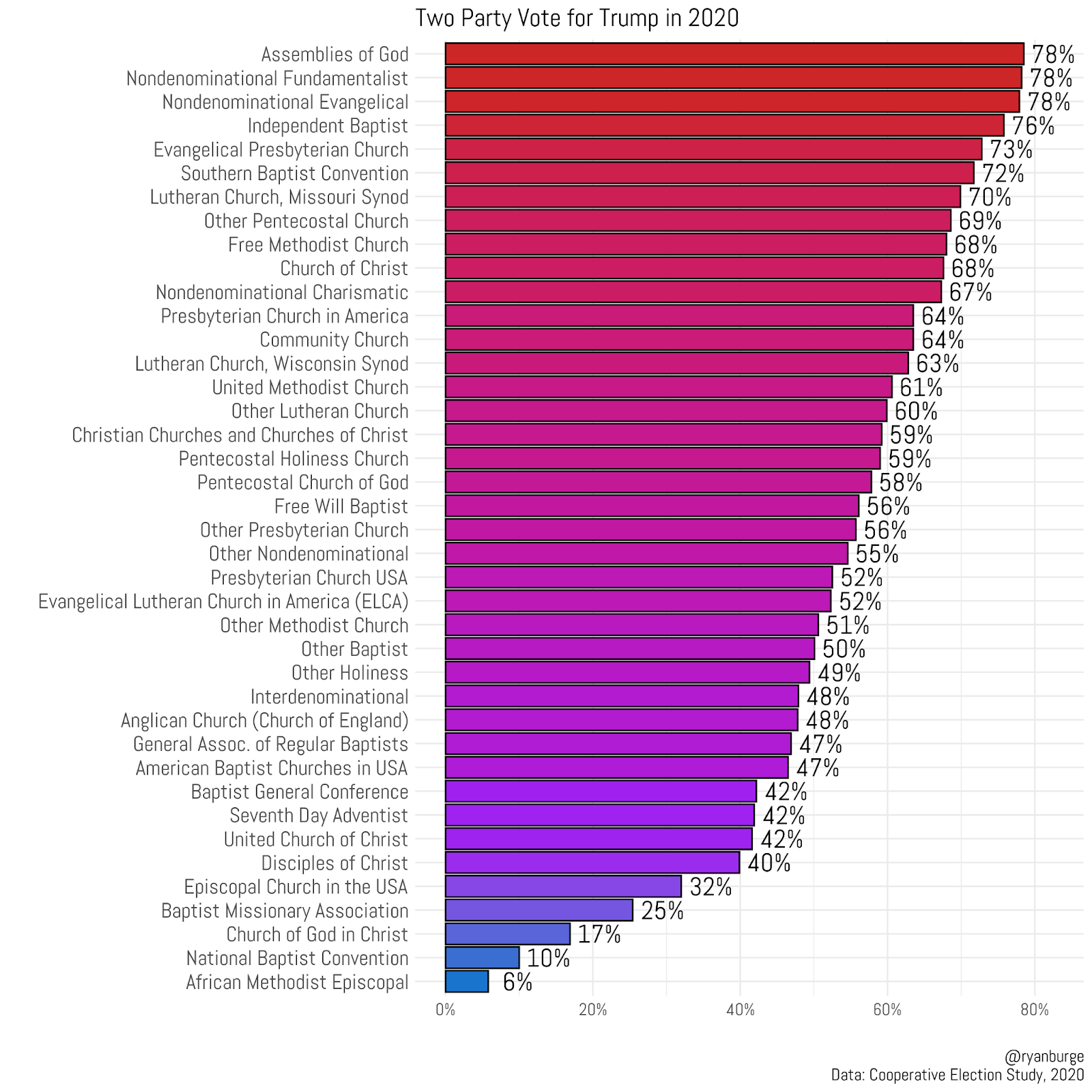
It always gets a nice bit of traffic and lots of shares and retweets and all that stuff. But, there is something inevitable that happens in the comments. People are very upset with me that I did not include their own specific denomination. People want to know where the Cooperative Baptists are, or the Nazarenes, or the Wesleyans, or the Unitarian Universalists. I’ve done this enough to know that everyone wants to see their own tradition included in analysis. We all want to feel like “we matter.” However, those kinds of comments just make me so incredibly frustrated with the state of data literacy in the United States. The average American has absolutely no idea how the sausage is made when it comes to the type of surveys that I use to produce all the charts, graphs, and maps you see on this newsletter and in various other channels.
Let me pull back the curtain just a bit on why my favorite response has become, “I’m data limited.”
The Coming Extinction of the White Christian Democrat

There are, despite some reports to the contrary, a significant number of Christians in the United States. In fact, Christianity will remain the most prevalent religion in the United States for decades to come. That’s something that Pew Research Center made clear in
I started graduate school way back in August of 2005. The fact that this was almost 20 years ago caused me to have an existential crisis the other day, but time doesn’t stop. When I began taking courses in American politics at Southern Illinois University, I quickly realized that the field was dominated by statistical analysis. Every paper seemed to have a nested bivariate probit regression. So, of course, I wanted to use all those fancy techniques in my own analysis of religion and politics in the United States. But, what I ran into was a pretty severe (and hard to overcome) problem. There just wasn’t that much data to be had out there.
The backbone of longitudinal statistical analysis of American politics is the American National Election Study (ANES). It’s been fielded with consistency since 1948. (By the way, there’s almost no publicly available survey data before that date). You can see the total sample size of each year that the survey was collected since its founding over 75 years ago.
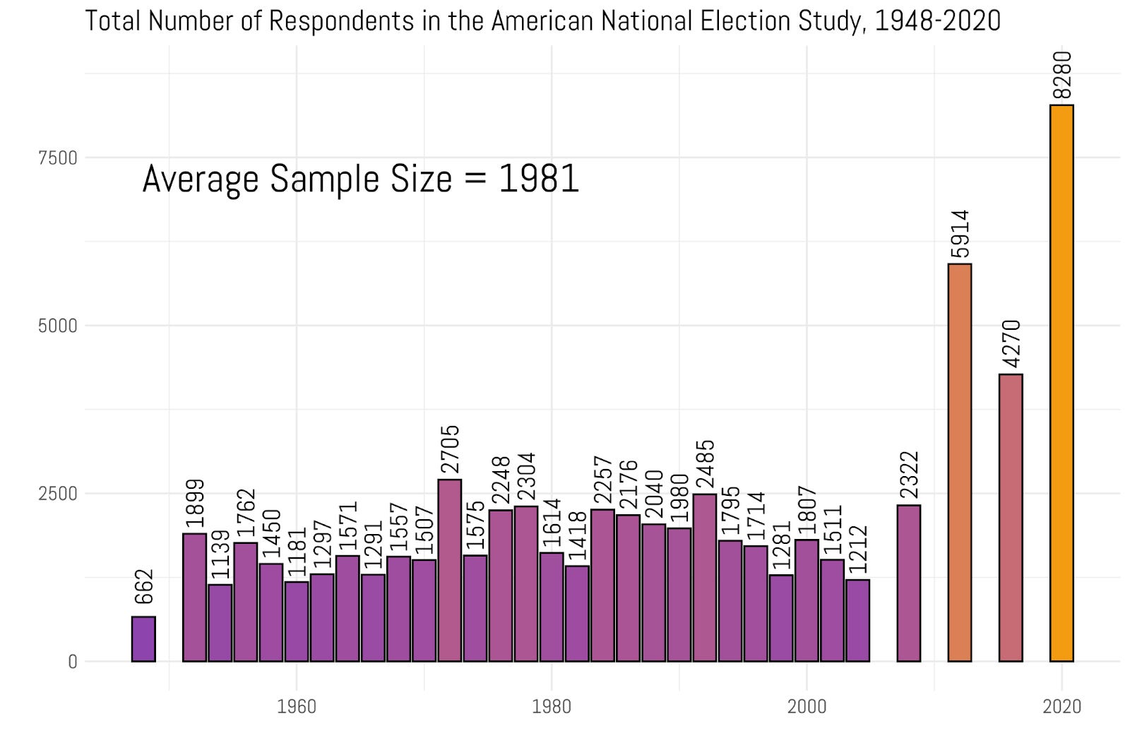
Full disclosure - I hate the ANES. It’s changed the way it classifies the religion variables at least three times since the 1960s. It also has an incredibly stupid way to name its variables. For instance, if an analyst wanted to do some longitudinal analysis in most surveys they would use a command like: group_by(year). You want to guess what it is in the ANES? It’s group_by(VCF0004), because that makes perfectly logical sense. It’s just a nightmare to wrangle and I only touch it if I have literally no other options when it comes to answering a question.
But the other problem is that there just isn’t that big of sample to use for any real purpose. In the 1960s, the average number of respondents was about 1,300. If you assume that about 5% of Americans were non-religious during that time period (which is impossible to know for sure), then you’ve got 65 folks you can analyze. I don’t think you need to take a stats course to understand why that’s incredibly problematic. Now, the sample size has gotten bigger in the last 20 years or so, which is good. But even with those larger surveys, an average wave of the ANES is less than 2000 respondents.
Like I said, I don’t use the ANES that much. I spend a lot more time focusing on the General Social Survey. The GSS labels its variables much more intuitively. For instance, a year is actually called “year”, a question about belief in God is called “god”, and the question about legalizing marijuana is called “grass.” Love that. The GSS began in 1972 and it’s been fielded basically every year or two since its inception five decades ago.
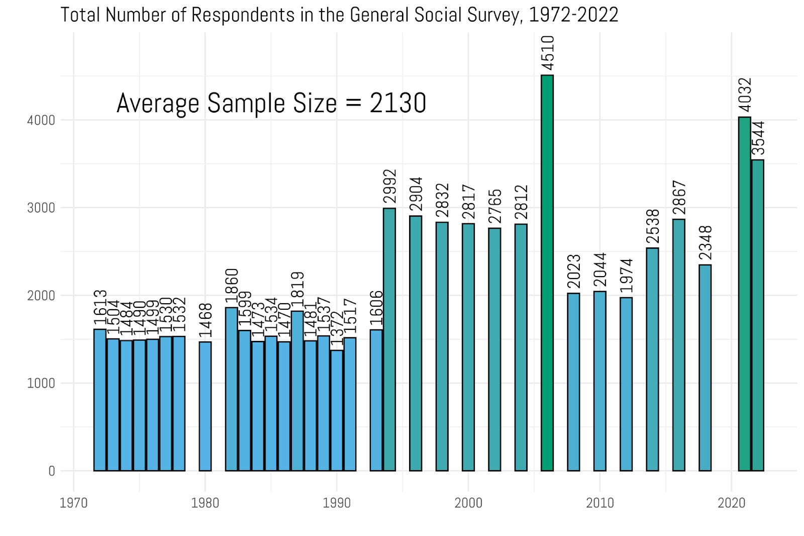
You can see the same problem here, right? The sample size is not that large. From the period that began in 1972 and ran through the early 1990s, the average sample was just about 1500 folks. It did jump up from there, though. In the 2000s it was a total collection that was much closer to 3000. The last couple of waves have been pretty robust, too - 3500 in 2021 and 4000 in 2022. That’s moving in the right direction. However, the GSS average sample is only 2,130. This is what I was confronted with when I was working through my master's thesis and doctoral dissertation - a lot of the questions that I really wanted to pursue were just not answerable with the data that I had.
There’s this thing that some social scientists do - they don’t start with a question and then look for data, they go in the opposite direction: they find some cool data and work their way back to the question. That’s basically what I do twice a week in this newsletter. For what it’s worth, according to the bible of political science methods Designing Social Inquiry by King, Keohane, and Verba, this is the exact wrong way to do it. But, I am not going to engage my readers in a discussion of epistemology here. That’s what my grad seminar in research methods is about.
Practically speaking, a young scholar of American religion and politics two decades ago had an incredibly limited set of questions that they could try and answer with the data available. Let me show you what I mean. I took the two largest Protestant denominations in the United States over the last fifty years: the Southern Baptist Convention, and the United Methodist Church and then counted the number of folks who were in each tradition in the GSS over the last fifty years.
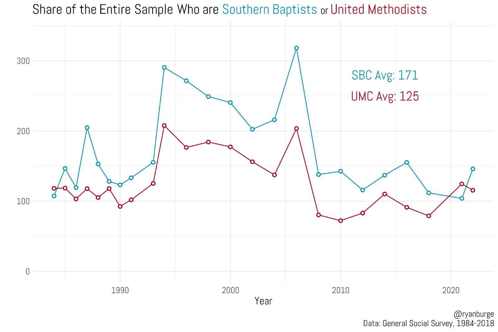
In 1972, there were about a hundred Southern Baptists and a hundred United Methodists. You can clearly see the explosion of the SBC in this graph through the mid-1990s which basically ended by the time Barack Obama took office in 2009. The United Methodist numbers have always lagged behind the SBC, and in some years there are less than 100 in the sample. In an average year of the GSS there are 171 Southern Baptists and 125 United Methodists. So let's say I wanted to use the GSS to figure out what percentage of United Methodists voted for Obama in 2008. What would be the margin of error? It would be in the neighborhood of +/- 9%. So, a point estimate of 55% for Obama could be as low as 46% or as high as 64%. You see the issue here? And remember this key point - I am discussing the two largest Protestant denominations. Not the smaller ones.
Let me just give you some numbers to wrap your head around. In the 2022 GSS there were a total of 3,544 respondents. Here’s how many were in some smaller religious traditions:
Episcopalians: 24
Presbyterian Church (USA): 9
Quaker: 4
Latter-day Saint: 31
You just cannot do anything with any of those groups unless you ‘bin them up’ by combining multiple years of surveys. Which can be acceptable if you assume the nature or composition of those groups doesn’t change that much over a five year window of time. But it’s not ideal, of course.
I graduated in 2011 with a doctorate in political science after writing a dissertation that exclusively used the GSS and ANES. It took me a couple more years to uncover this unbelievable new survey called the Cooperative Election Study. I say this without exaggeration - without this data source at least 70% of the analysis you see here would be impossible. Why? Because the CES is absolutely huge! Let me show you.
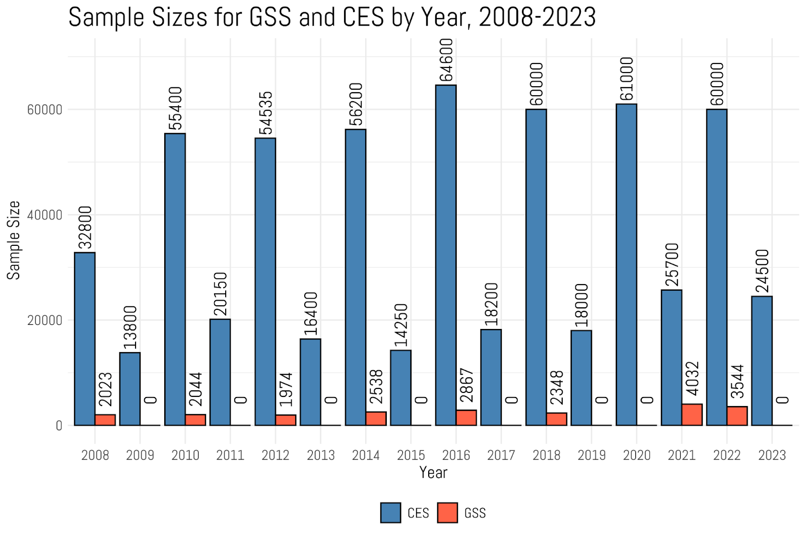
The smallest sample of the CES was in 2008 when they only polled 32,800 people. From there it just exploded. In an election year, the sample has been consistently about 60,000. I've heard the 2024 sample size is actually north of 75,000. Which is just mind-boggling when compared to such a paucity of data we had for decades. To put that number in perspective, the entire time series of the GSS, which spans fifty years and 34 different collection periods, has a total sample size of 72,390. The CES polled more people than that in just 2024.
What Does it Mean to be 'Religious'?

This post has been unlocked through a generous grant from the Lilly Endowment for the Association of Religion Data Archives (ARDA). The graphs you see here use data that is publicly available for download and analysis through link(s) provided in the text below.
If I combine all the CES surveys into one dataset, it’s currently at 632,000. After I merge the 2024 data it will be 700,000. That’s about ten times the GSS. The CES is also pretty good for my purposes. It asks a couple of questions about religion that I love - religious importance, born-again status, religious attendance, and prayer frequency. It also has a robust religious tradition battery. You are given a range of options like Protestant, Catholic, LDS, Jewish or Atheist (there a dozen in total). If you say Protestant then you are filtered down into a bunch of families (like Baptist, Methodist, Pentecostal). Then once you pick one there, you are filtered once more into a specific denomination. So if you say you are Baptist you get a list of options like Southern Baptist, American Baptist, Free Will Baptist, etc.
That’s how I created the very first graph in this post. I just took the 40 denominations that had the most respondents and calculated the proportion who said they voted for Donald Trump. This is how many people were in each denomination in the 2022 Cooperative Election Study. Remember, this is a total sample of 61,000 Americans.
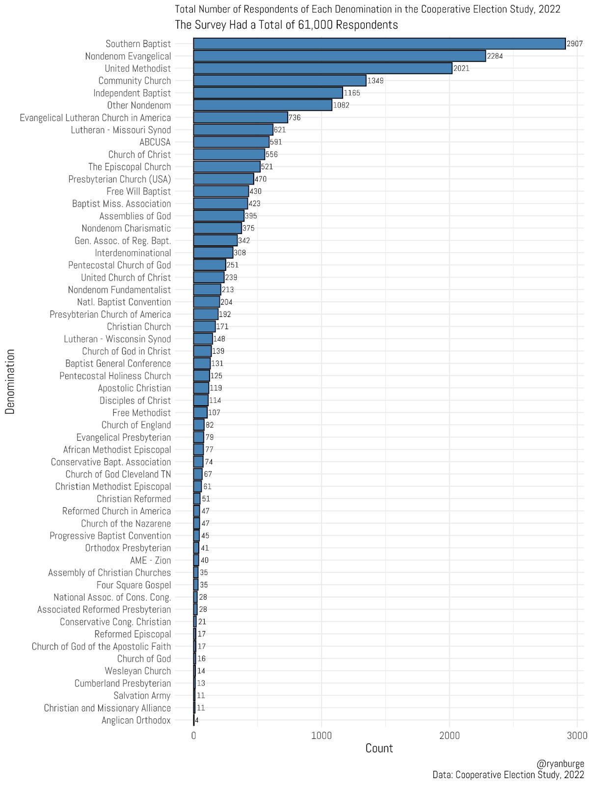
In that huge sample, there were 31 total denominations that had at least 100 respondents. And for many people on social media that isn’t enough. I guess that’s what gets me so heated. Twenty years ago, I couldn’t even give you five denominations that hit triple digits on any survey. Now, I can get to about 30 of them. That’s an absolute revolution in the field of religion and politics in the United States.
So, before you slide into my comments and say where are the Unitarian Universalists on my graphs, I want you to take a second and go find out how many UUs there are in the country. According to their own website, it was under 200,000 in 2018. If I randomly sampled 2000 Americans, guess how many UUs would pop up? I would be lucky if it were 2.
The way I describe it is: I used to be incredibly data limited. Now, I’m just pretty data limited. And that’s been more than enough to write 100 posts a year.
Code for this post can be found here.
What else am I up to besides clogging your inbox twice a week?
I thought you all might want to get a sense of what’s on my roadmap for publishing over the next couple of years.
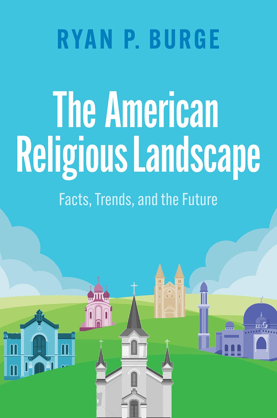
I have a book with Oxford University Press coming out in just a couple of weeks. It’s called The American Religious Landscape: Facts, Trends and the Future. It’s basically a textbook of American religious demography - with chapters on groups like evangelical, Latter-day Saints, Muslims, and atheists. There are well over 100 graphs in this one.
I have just wrapped up the finishing touches of a pretty complete draft of a book for Brazos Press. It’s entitled The Vanishing Church: How the Hollowing Out of Moderate Congregations Is Hurting Democracy, Faith, and Us. I am incredibly proud of this book. It’s easily the most personal and most important thing I’ve written to this point. Right now, it’s scheduled for a release in the early part of 2026. I will make sure I let you all know how to pre-order.
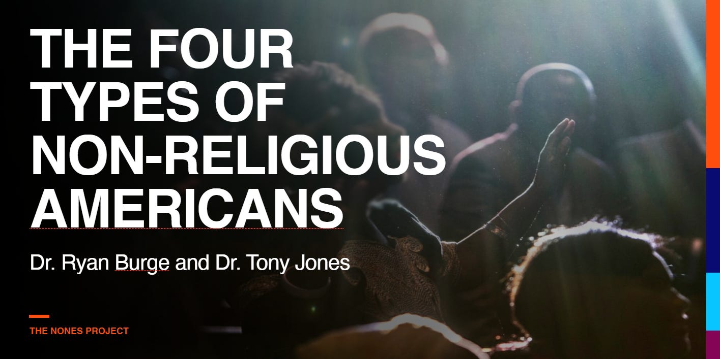
Tony Jones and I are neck deep in data thanks to a Templeton Grant entitled, Making Meaning in a Post-Religious America. We fielded two surveys of the nones (with the first being over 12,000 atheists, agnostics, and nothing in particulars). As a result of all that good data, we have created a new typology of the nones that I think you all will find both interesting and helpful. We are working on that book project right now and hope for publication in late 2026.

Michael Graham and I have signed a two book deal to extend the research that we did in The Great Dechurching. In the next few weeks we will be fielding what we believe to the largest and most detailed survey of religion ever attempted. Insights from that instrument will serve as the empirical backbone for two books that will publish in 2027 and 2029.
And there’s a couple of other projects that are dangling out there that may (or may not) show up in the next couple of years, including a book with Paul Djupe about non-denominationalism as well as taking over the reins of the best textbook about religion and politics in the United States.
That should keep me pretty busy for the next five years - along with continuing this newsletter. As always, I am constantly amazed that this many people actually care about the work that I’m doing. I am deeply humbled that so many of you want to see me ‘thinking out loud’ in this newsletter.
You have my empathy. Far easier (and more sane) to start with data and find the patterns than go the other way.
Let me share an anecdote from this last week on a group that will *never* show up in your data.
I was doing (non-political) surveys with an Amishman a couple weeks ago, and finished by asking who else I should talk to. He mentioned a greenhouse owner up the road, but told me not to share who sent me. I asked why, and he shared that this year they experienced a record number of pushy political canvassers. Amish aren't supposed to vote, and they nearly always follow that rule (they sometimes make exceptions for intensely local issues like milk regulation). So pushy canvassers directly undermine their shared values. Their whole settlement (~500 people) was sick of it.
I asked if there was ever a time in history when they experienced a similar level of pressure to vote? He responded without hesitation: it's never happened in the U.S., but did happen in 1930s Germany.
He wasn't comparing either political candidate to Hitler, nor was he making any predictions about what the current historical moment means. I'm only sharing it because it's a perspective that won't show up in the data, but is interesting nonetheless. Especially since there are now more practicing Amish than Episcopalians.
And what about Swedenbogians? We get no respect. Seethe, gnash!