

What Generation Can We Blame for Religious Decline?

I was giving a talk to some seminary students a couple years ago and one of them came up to me afterwards and said, “I want to do what you do.” My initial reaction was a dumbfounded look and a pretty simple question back, “What is it I do, exactly?” That’s still how I feel about my career, really. I get a variation of that question on a pretty regular basis now. And I totally understand the urge to try and figure how it all happened. The honest answer is - I really have no idea. I feel like Forrest Gump, “One day I just started tweeting.” Then I didn’t really stop for years.
A lot of that progression happened very glacially. I never had this inflection point where my followers would double overnight or anything. However, I can specifically point to a moment where I broke through. It was in March of 2019. And it was this tweet.

It went viral and the story of that one single graph formed the introduction to my very first book The Nones. It was the launching pad for writing for a lot of religious outlets like Christianity Today and Religion News Service. Well, guess what? It’s six years later and I’m still fascinated by that graph of the American religious landscape over the last fifty years. I still look back at it on a pretty regular basis. Here’s the most updated version of that same data - just extending the timeline through 2022.
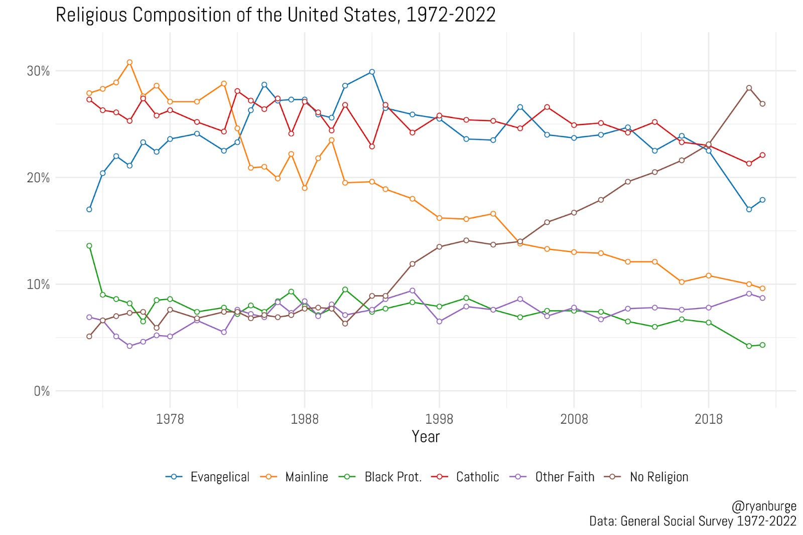
I can basically recreate the trajectory of each religious tradition without looking at this graph by now. Evangelicals were 17% of the country in 1972, they rose to about 30% in the early 1990s and now have dropped back below 20% in the last two surveys. Catholics are pretty stable around 25% for a long time, but that’s dropped a few points in recent years. The Black Protestant and Other Faith lines are pretty unremarkable over time.
Four of the Most Dramatic Shifts in American Religion Over the Last 50 Years

One of the true gifts of being a quantitative social scientist in 2023 is that I get to stand on the shoulders of the giants who came before me. A handful of scholars fought hard to get a series of religion questions added to the General Social Survey when it was first fielded in 1972. Then they had to fight to keep those questions on there over the las…
The two biggest movers are the mainline and the non-religious. The mainline was over 30% of the sample in the mid-1970s. They dropped to 20% by 1990 and have just continued to slide from there. They are about 10% of adults today. Meanwhile, the nones have gone the opposite direction. They were 5% between 1972 and 1990 and then just shot up from there. Above 10% by 1996, north of 20% by 2014, and then they hit 28% in 2021.
I wanted to do something that I’ve never really done in depth until now - go back one layer of abstraction and try and figure out which generations are to blame for the rise and fall of each religious group. That’s really the setup here - a whole bunch of line graphs that I think are helpful in peeling back the onion a little for what is happening at the core of the American religious landscape.
Let’s start with evangelicalism.
