How Many People Change Religions in 18 Months?
The Promises and Pitfalls of Using Panel Data
This post has been unlocked through a generous grant from the Lilly Endowment for the Association of Religion Data Archives (ARDA). The graphs you see here use data that is publicly available for download and analysis through link(s) provided in the text below.
Often I get asked questions during talks about the interaction of religion and politics. Basically, people want to know how voters in the United States arrive at their decisions on election day and how much theology or religious affiliation plays a role in that process. I must admit that political science doesn't really understand how folks make their voting decision for candidates such as Biden or Trump. And there’s a simple reason for that lack of certainty: most voters can’t fully articulate how they arrived at their selection. Or, if you asked them to describe their decision making process a few times during election season, they would give you a different answer every time.
Of course, religion does play a role in this. But the dominant view in the field of religion and politics is that partisanship matters a lot more than religion. We have arrived at this conclusion through some really tremendous work that has been published in the last decade or so. I list a whole bunch of that at the end of this post:
But, a key thread runs through a lot of that scholarship - the use of panel data. Let me take you through a quick methodological discussion of how panel data can unlock a lot of insights.
Most of the analysis that I do for Graphs about Religion comes from what is called longitudinal survey data. The General Social Survey (GSS), the American National Election Study, the Cooperative Election Study, and Nationscape are all longitudinal data. The principle behind this is simple: the survey team goes out into the field and collects a random sample of the general public. Then, a year or two later, they repeat the process. That means that there is a very low likelihood that the same individuals will be sampled in more than one collection cycle, ensuring a new sample each time.
So, if the GSS data indicates that the share of Americans who are non-religious was 20% in 2008 and that figure jumped to 30% in 2018, figuring out the causal mechanisms for that shift is not straightforward. We don’t know if it’s because 10% of the religious population became nones and no nones became religious. Or maybe half those nones became religious between 2008 and 2018, while 20% of the rest of the sample went from religious to non-religious. Get what I am saying here?
This can be really problematic when reporting a fairly straightforward empirical result. Example: evangelicals have become more conservative over time. There are a number of explanations for that:
All the evangelicals just moved to the right over time but the overall composition of that subgroup didn’t change.
More conservative people joined evangelicalism and thus the mean moved to the right.
More liberal evangelicals changed their religious affiliation and thus the mean moved to the right.
Older and more moderate evangelicals died off and thus the mean moved to the right.
It could be a combination of all four of those causes or another explanation that I didn’t even describe that gets us to the same conclusion.
This is where panel data becomes especially useful. Instead of doing a random sample of the population every year or two, panel surveys ask the same questions of the same people over a long period of time. Thus, this type of data can tell what percentage of Catholics became evangelicals or what percentage of people left evangelicalism for no religion.
It’s an incredibly powerful tool. I’ve often joked that if you gave me a large enough panel survey, I could answer all the questions that have been plaguing social science for decades. I’m exaggerating, of course, but not by much.
But there are some real obstacles to doing panel surveys. They are incredibly expensive. I think it would be impossible to do a large one over a longer period of time for less than a million dollars. They are logistically difficult - you have to have a research team that is constantly working on this project for years. Graduate students finish their degrees, professors move to a new university. That makes continuity hard.
But the biggest hurdle of all is attrition. If you want to track people over a five year period of time by polling them annually, how many are you going to have left at the end of that collection period? The answer is: not that many. And what makes that difficult is that survey attrition doesn’t happen randomly. Certain groups are more likely to drop out than others.
You could have a really good random sample of 5000 people that look like the general population on gender, race, age, education and income. But after five years that sample may be down to a thousand folks who are 90% white, 75% female, and the majority of them have a college degree and make six figures. It’s not easy to correct for all those shifts using survey weights.
But that’s not to say we can’t learn things from panel data. And, because of the Association of Religion Data Archives, I have some! It’s called Putting Politics First and was collected by some of the most well respected scholars in religion and politics - Dave Campbell, Geoffrey Layman, and John C. Green. This team used the research for part of their important book Secular Surge. I recommend you read it.
The panel data was collected in four waves. But I wanted to just focus on the first time that folks were asked about their religious affiliation and then the last time they were asked. Those events happened in the Summer of 2011 and then again in October and November 2012. I’m just going to call that about 18 months between collection periods, even though it’s probably just a bit less than that.
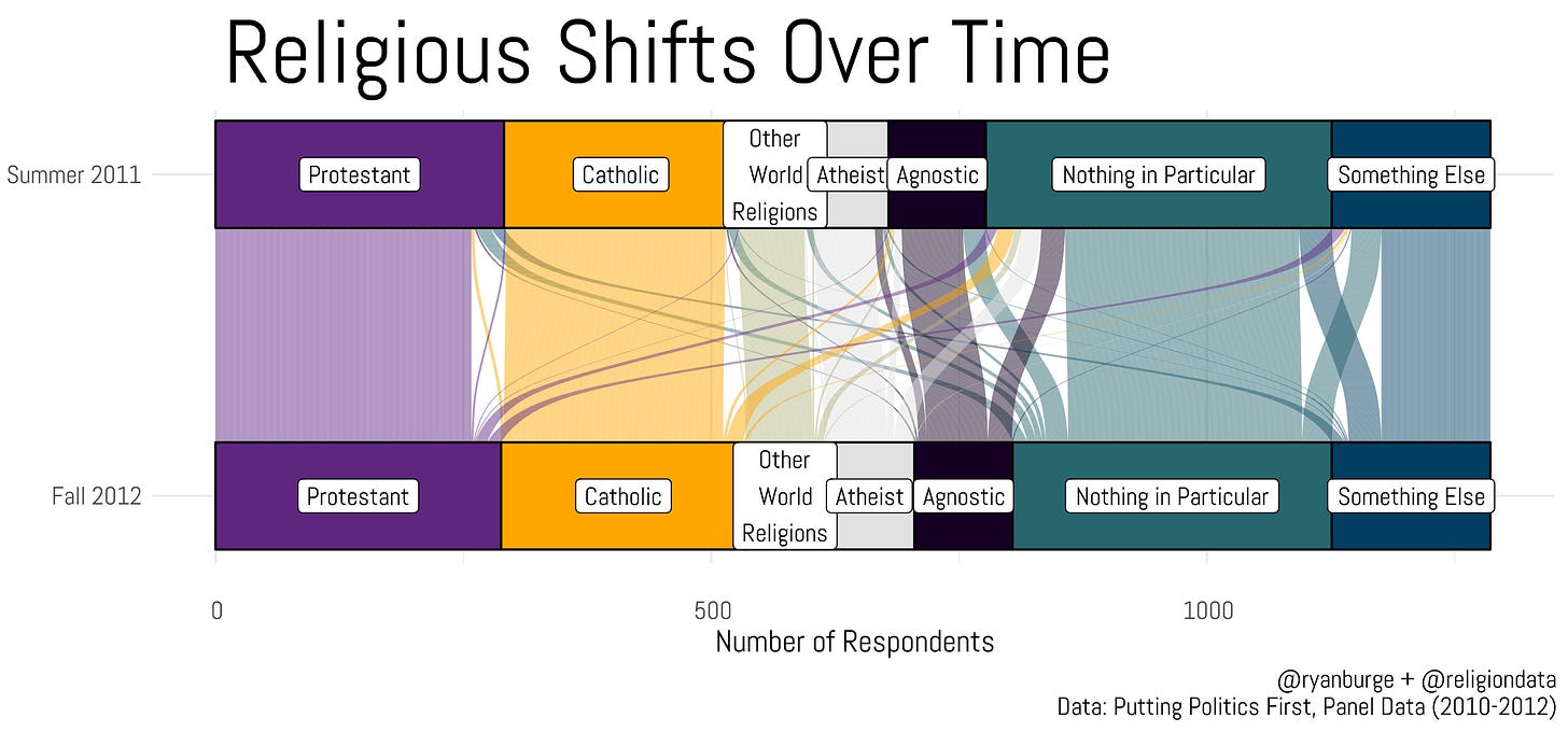
This is an alluvial diagram of how folks moved between identities during those two waves of the survey. These graphs are visually stunning but don’t really have the ability to provide actual numbers when it comes to shifts in religion. But you do get a general sense of how much volatility that’s happening when it comes to religious belonging. During this time period, about 21% of the sample changed their answer to a question about their present religion.
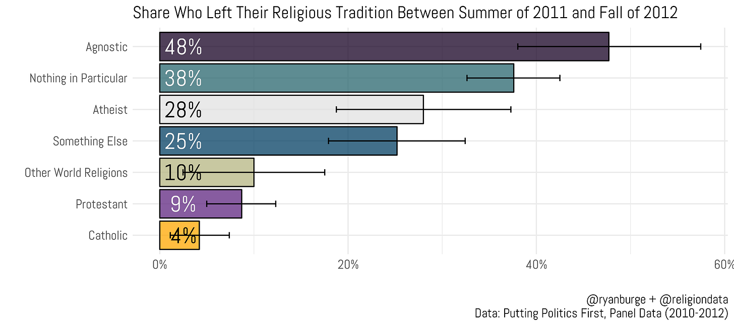
To make it more digestible, I calculated the share who changed their religious affiliation by the Fall of 2012 based on how they answered the question during the initial wave in the Summer of 2011. One thing you need to keep in mind - these are small sample sizes. There are just 75 folks who are in the “other world religions” camp and only 77 said that they were atheist. That’s always a problem with panel data - the sample sizes (N) are often not large enough for broad generalizations.
Agnostics in the Summer of 2011 are the most likely to say that they were no longer agnostic in the Fall of 2012 - it was nearly half. In fact, the three types of nones were the most likely to engage in religious switching. 38% of nothing in particulars had changed their affiliation over the course of 18 months, and the same was true for 28% of atheists. The two Christian groups are the least likely to move around. Just 9% of Protestants were no longer Protestants 18 months later. For Catholics, it was even smaller at just 4%.
This is where things get really hard. I know what you want me to show you right now - when these different groups switch, where do they end up? That’s a great question. But I just don’t have a big enough sample to really get into the weeds of that whole thing. There are a total of 2,635 folks in the survey in Wave 1. By Wave 4, just 54% of the sample was left. So now we are down to just 1,223. The number of people who responded to all four waves of the panel data and switched their religion between Wave 2 and Wave 4 was just 272.
Let me put some actual numbers on this. There were a total of 36 people who identified as Agnostic in Wave 2 but weren’t agnostic in Wave 4. 8% of them became Catholic. You know how many actual respondents that is? Three people. So, it would be unwise to make some big proclamation about the agnostic to Catholic pipeline based on this survey.
But, here’s my best attempt to show you how folks move around the religious landscape.
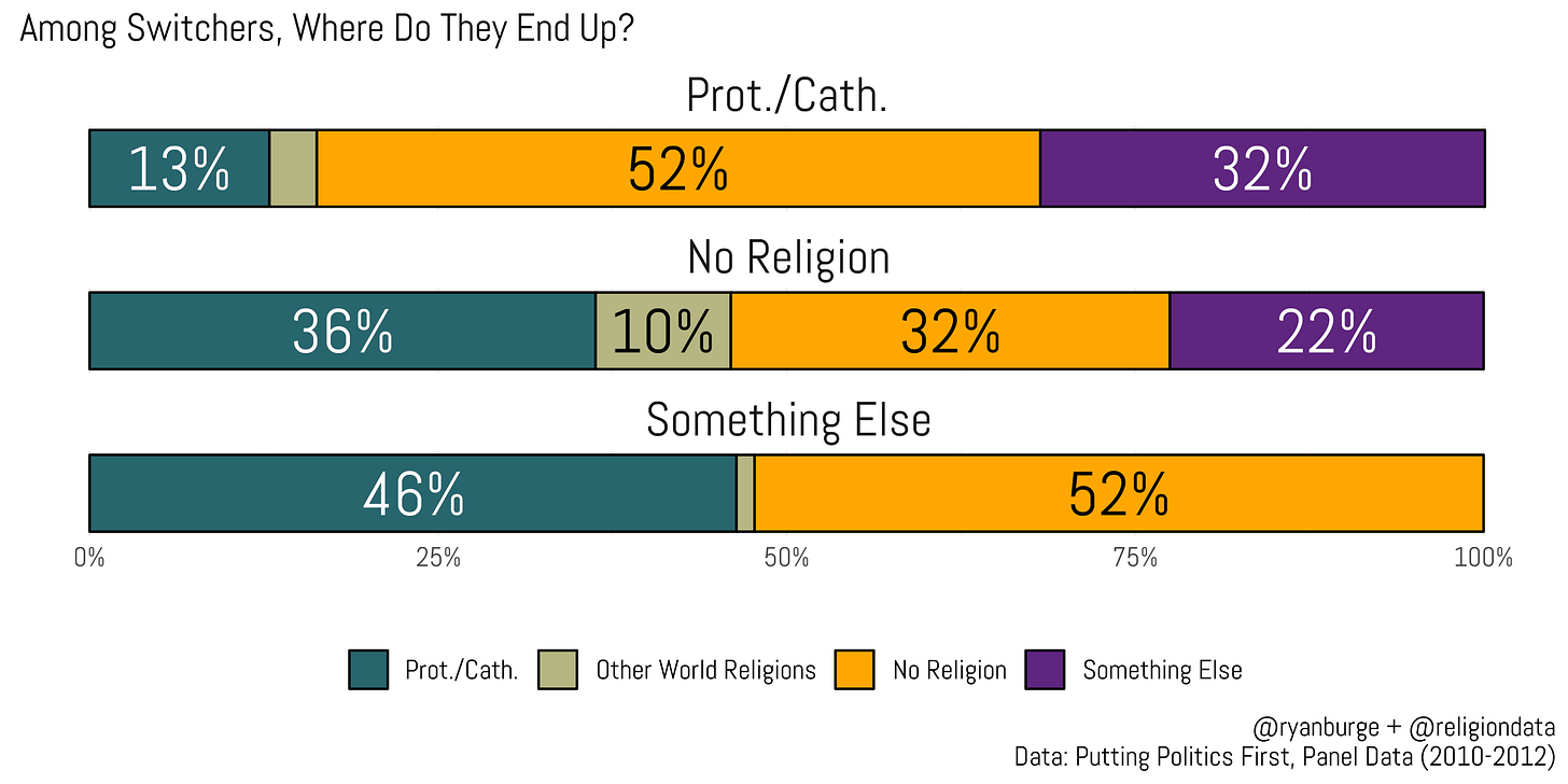
If a Protestant or Catholic leaves their religion, the majority end up identifying as 'nones' (those without a religious affiliation) - that was true for 52% of Christian switchers in this data. Another third goes into the “something else” category which is a potpourri of people who say that they are spiritual but not religious or Jedis or don’t know what the word Protestant means and will write something like “Baptist.”
Among the nones, among those who leave, about a third just go to another type of none (think atheist to agnostic or agnostic to nothing in particular). About one third of them end up in a Protestant or Christian category and one in ten claim another world religion like Islam, Buddhism, or Hinduism. But that’s about all I can tell you using this data.
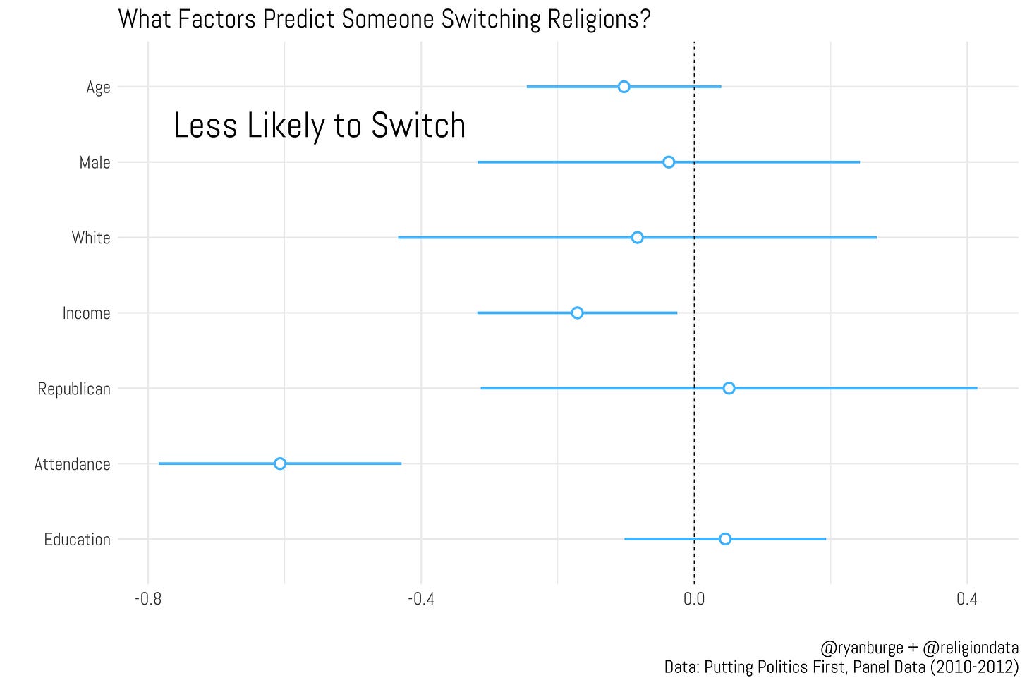
But here’s what I can do with this data - tell you what factors make someone more or less likely to switch their religious affiliation. I put together a regression model that predicted switching using a lot of basic demographic factors: age, gender, race, income, education, religious attendance, and a Republican affiliation.
What variables mattered here? Not many, honestly. See how many times that blue lines intersect with the dashed line at zero? That means that those factors are not predictive at all. That was the case for age, gender, race, partisanship, and education. None of them make one more (or less) likely to change their religious affiliation.
There were two variables that made one less likely to switch religions. The first was household income - individuals with higher household incomes were found to be less likely to change their religious affiliation. The other was religious attendance. Those who were attending their current house of worship more were less likely to switch. Which makes sense - very committed people tend to attend church more. A deeper commitment to their current faith makes one less likely to leave it behind.
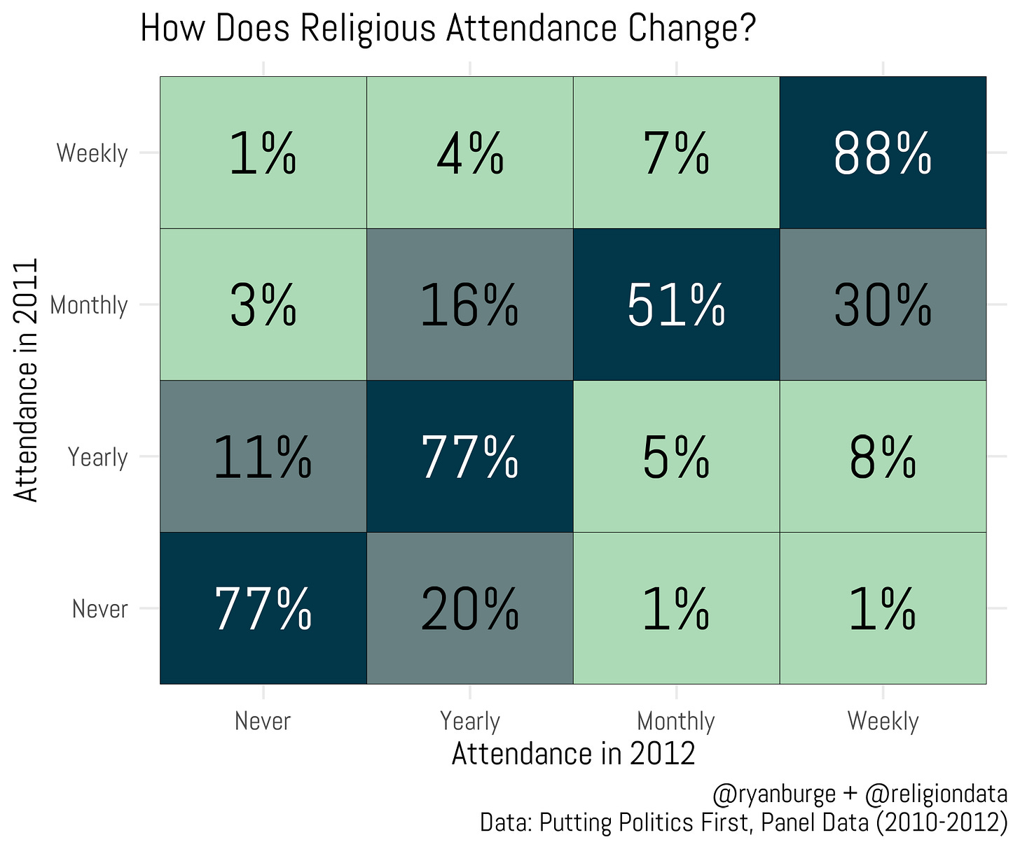
One final question is worth pointing to: religious attendance. Respondents were asked about it in both the Summer of 2011 and the Fall of 2012. Here’s a heatmap of how attendance changed during those two collection periods.
Among people who were attending their house of worship every week in 2011, 88% were still weekly attenders in 2012. Another 7% of them said that their weekly attendance had dropped to monthly attendance. Among monthly attenders in 2011, about half were also monthly attenders in 2012. But, 30% had increased their religious attendance. So, 81% of monthly attenders in 2011 were attending at least that much the following year.
Among yearly and never attenders, their attendance didn’t increase significantly. In both cases, 77% were attending at the same rate the following year. About 90% of yearly attenders in 2011 were attending yearly or less in 2012. Among never attenders in 2011, 97% were in the never or yearly camp in 2012. Think about this: just 1% of weekly attenders became never attenders and 1% of never attenders were going weekly about a year later. It’s very rare for religious attendance to dramatically shift at the individual level.
I wish that I could use data like this and put together some findings that will generate huge headlines, but that’s just not what can usually be gleaned from panel data. Yes, people do change their religion. But when they move, it’s typically one step to the right or left. There is not a huge movement between atheism and Protestant Christianity or vice versa.
You can also see that clearly with religious attendance. Most people attended as much in 2012 as they did a year earlier. If they did answer differently it was often just one move up or down the attendance ladder. Dramatic movement in religion is incredibly rare, honestly. But, every religious group that I have ever studied has tried to use these dramatic examples to illustrate the power of religious faith.
During the Super Bowl there was an ad run by a group called He Gets Us that was a series of images of people watching other people’s feet as a nod to the Biblical act of Jesus washing the feet of his disciples. Some Christians weren’t too fond of that ad - believing that it should highlight stories of people who dramatically changed their lives when they became evangelicals.
An alternative ad posted by Jamie Bambrick points out examples of radical transformation of people to Christianity: Richard Dawkins’s right hand man who became an evangelical or Mohamad Faridi who went from being a Jihadist to a follower of Jesus. Yes, those things do happen. But they are also incredibly rare according to the data.
The way that the average American changes religion is slow, steady, and undramatic. They were once a member of a specific faith group and now they aren’t. It wasn’t any type of epiphany - just a gradual move from one identity to another.
Code for this post can be found here.


Very interesting
Ryan, you made one assumption that really jolted me out of your article. You said, "The other was religious attendance. Those who were attending their current house of worship more were less likely to switch. Which makes sense - very committed people tend to attend church more. A deeper commitment to their current faith makes one less likely to leave it behind."
What is your basis for this assumption? Couldn't it also be that people who attend worship frequently go not because of their own commitment, but because their houses of worship actually offers them something they need?
And people who avoid houses of worship and religion like plague don't switch would never find out one way or another whether religion and houses of worship offers them something they need or want.