Are Shrinking Counties Seeing Religious Growth?
Here’s a fun fact that I like to share when I’m in a room full of academics: I have never lived in a town with a population that exceeded 20,000. That’s almost unheard of inside the halls of the ivory tower. A lot of academics grew up in large metropolitan areas, and if they didn’t, they certainly moved to a larger city to attend undergraduate or graduate school. I think that’s one of the reasons why teaching in a place like Charleston, Illinois doesn’t bother me. It’s all I’ve ever known.
There are advantages to living in a small town. We bought a 2,500-square-foot, all-brick home that was built in 1940 for a very small amount of money about fifteen years ago. Our mortgage payment is lower than most car payments. Traffic is never an issue. I can basically park wherever I want. It takes a grand total of fifteen minutes to drop both of my boys off at school, which are in different parts of town. Most of the time, we don’t lock our doors. There’s almost no crime in our neck of the woods. It’s just an easy way to live honestly. I visit places like Chicago and New York City on a semi-regular basis. When I’m there, my blood pressure is probably 15% higher. I’m just not used to all the hustle and bustle.
There are downsides, of course. The airport is about a 90-minute drive away. If you want to get the best medical care, it’s going to take an hour to get there. And there’s not a ton of new development. The population of my county was about 36,000 in 1950, according to the Census Bureau. Their latest estimate from 2023 was still about 36,000 people. The United States had 150 million people in 1950; it has about 330 million today. Jefferson County hasn’t been the engine of that growth.
That sent me down a data analysis rabbit hole that focused on a couple of questions: What counties in the United States are growing? And is there a direct relationship between county-level population change and the religious composition of those counties? I learned a lot. Let me share some of it.
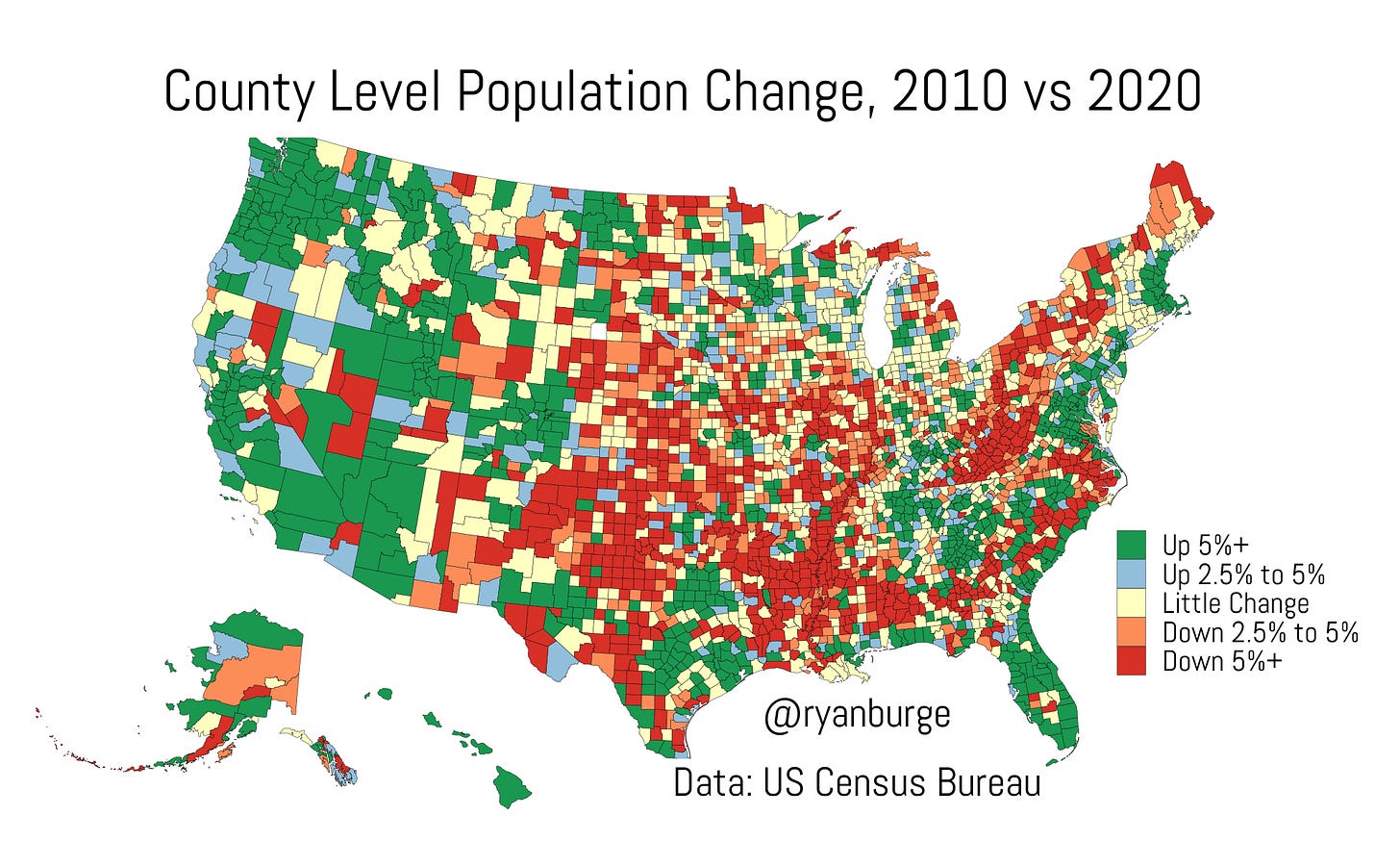
This is a county-level map that visualizes the population change in counties between 2010 and 2020.
Here are some numbers to think about. This is the percentage of counties in each of the different categories:
Down 5% or more: 26% of counties
Down 2.5% to 5%: 13%
Little Change: 26%
Up 2.5% to 5%: 9%
Up 5%+: 26%
So, the number of counties that have grown quickly is about the same as the number of counties that have declined just as quickly, and then another quarter are holding pretty steady.
But the dark red is pretty easy to see, right? It’s all over the Texas panhandle and up into Oklahoma and through Kansas. The Mississippi River is also flanked by counties in decline, which is especially prominent in the South. But you can also see a huge blob of red in West Virginia and the western part of Virginia, and all through upstate New York.
Where are the pockets of green? There’s a whole bunch in the Pacific Northwest. Oregon and Washington counties are almost universally growing. But there’s also lots of green in big chunks of the West Coast. You can also see an almost unbroken line of green from Florida all the way up through Massachusetts. You can basically describe growth in the United States like this: both coasts and the southern half of the country.
Do you want to zoom into your specific county and see how the population has changed over the last ten years? Well, I made an interactive map to do just that.


